5Expectation and Understanding: The Z-Distribution
Every distribution we have met so far has its own units - inches, dollars, IQ points, reaction times. That makes them impossible to compare directly. The z-distribution is our universal translator: a way to put any value, from any normal distribution, onto one common ruler. Master this one distribution and the entire inferential half of the book opens up, because every test we run is, underneath, a z-in-disguise.
5.1 Learning Objectives
Understand the z-score as a value’s distance from the mean, in standard-deviation units.
Understand the standard normal distribution and read probabilities as areas.
Use R (pnorm, qnorm) instead of a dusty z-table.
See why this distribution is the foundation for the inferential chapters ahead.
5.2 The Z-Score: One Ruler to Rule Them All
A z-score answers a single question: how many standard deviations is this value from its mean?
\[z = \frac{x - \bar{x}}{s}\]
That is the whole formula. Subtract the mean (now centered at 0), divide by the standard deviation (now measured in SD-units), and every variable on Earth speaks the same language.
Is a 1350 SAT better than a 30 ACT? On their own scales, who could say. In z-units the question is trivial: the ACT score is further above its mean, so it is the more impressive result. That is the magic of standardizing - incomparable things become comparable.
5.3 The Standard Normal Distribution
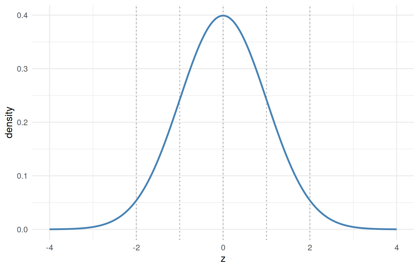
Standardize a normal variable and you get thestandard normal distribution: a bell curve with mean 0 and standard deviation 1. It never changes, which is exactly why it is useful - we can chart it once and reuse it forever.
Figure 5.1: The standard normal, with dotted lines marking z = -2, -1, 0, 1 and 2.
The famous 68–95–99.7 rule lives here: about 68% of values fall between \(z=\pm1\), about 95% between \(z=\pm2\), and about 99.7% between \(z=\pm3\). Anything past \(z = \pm2\) is already unusual; past \(\pm3\), rare.
5.4 Is the Normal Assumption Defensible?
We are about to lean on this one curve for the rest of the book, so it is fair to stop and ask whether we are entitled to. In the best-guess chapter we watched sixteen flat random steps add up into a bell. Adding is one route to the normal. There is a second, and it matters because a great deal of biology and behaviour does not add - it compounds.
Suppose an outcome is produced by a dozen small effects that multiply rather than sum: each one raises or lowers the result by a few percent. Growth works like this. So do many dose-response and learning processes.
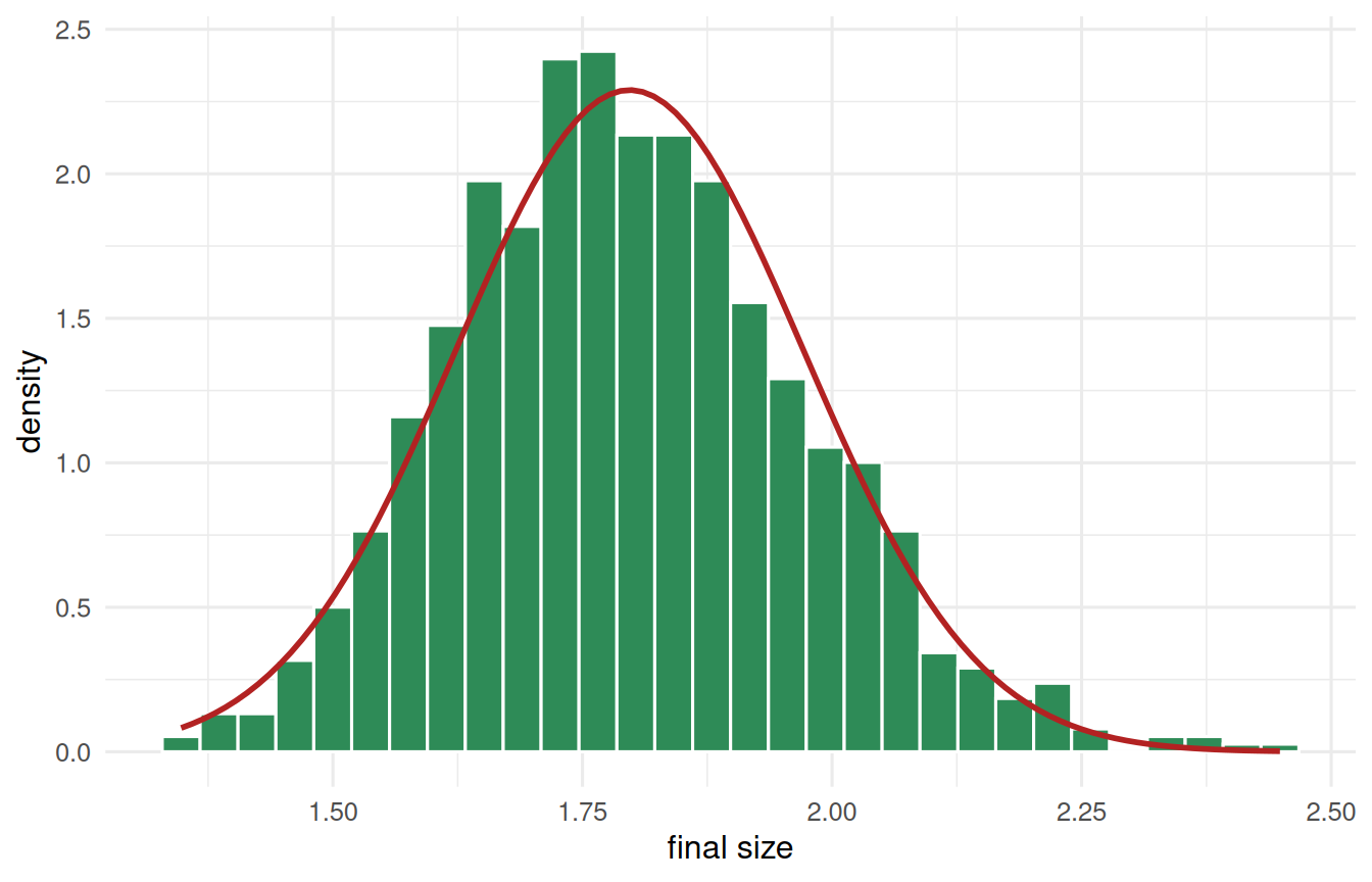
set.seed(5)# 1000 organisms. Growth is 12 small effects MULTIPLYING together - each one# adds somewhere between 0% and 10% - so nothing here is being summed.growth <-tibble(organism =1:1000) |>mutate(size =map_dbl(organism, \(i) prod(1+runif(12, min =0, max =0.1))))ggplot(growth, aes(x = size)) +geom_histogram(aes(y =after_stat(density)), bins =30,fill ="seagreen", colour ="white") +stat_function(fun = dnorm,args =list(mean =mean(growth$size), sd =sd(growth$size)),colour ="firebrick", linewidth =1) +labs(x ="final size", y ="density") +theme_book()
Figure 5.2: Growth produced by twelve small multiplicative effects. Multiplying numbers close to 1 behaves almost exactly like adding them, so the bell appears here too.
A bell again. The reason is quietly elegant: multiplying numbers close to 1 is almost the same as adding the small amounts. \(1.05 \times 1.03 = 1.0815\), and \(1 + 0.05 + 0.03 = 1.08\). Near enough that the addition argument takes over. So small multiplicative effects land in the same place small additive ones do.
That gives us two honest mechanisms rather than a convention:
Many small influences that add produce a normal.
Many small influences that multiply produce a normal too, because small multiplications behave like addition.
ImportantWhat this argument does not license
Being able to defend the normal is not the same as assuming it everywhere, and a psychologist who overclaims here deserves the criticism they will get. The argument fails in specific, recognisable ways:
When the effects are large and multiplicative. Multiply by 2 and 3 rather than 1.05 and 1.03 and the addition approximation collapses. You get a long right tail - incomes, city sizes, citation counts. Take logarithms and the normal returns, which is exactly why so much of economics is done in logs.
When the outcome is a count or a proportion. Number of symptoms endorsed, number of errors, percentage correct. These are bounded at zero, or at zero and one, and a bell drawn over them will predict values that cannot exist.
When one influence dominates. The bell needs many contributors of comparable size. If a single factor drives most of the variance, you get that factor’s shape, not a normal.
When observations are not independent. Students within classrooms, trials within a person, siblings within a family. The counting argument that produces the bell assumes the nudges are unrelated.
There is also a distinction worth getting right, because it is the source of a great deal of needless worry. In regression and ANOVA, normality is an assumption about the residuals - what the model failed to explain - not about the raw outcome. A wildly skewed outcome can leave beautifully normal residuals, and a symmetric outcome can leave terrible ones. Look at what the model missed, not at the histogram of \(y\). We show you how in the regression chapter, and what to do when it genuinely fails in Beyond the Normal Curve.
So the honest position, and the one this book takes: the normal distribution earns its place through a mechanism you can demonstrate in three lines, it covers a great deal of what psychological science actually measures, and it has limits you should be able to name. That is a much stronger footing than either assuming it reflexively or abandoning it apologetically.
5.5 Probability Is Area (and R Is Your Z-Table)
Older books make you hunt through a printed z-table to convert a z-score into a probability. We have R, so we will never do that. Recall from the distributions chapter that probability is area under the density curve. Two functions give it to you instantly:
pnorm(z) - the area to the left of z (the cumulative probability).
qnorm(p) - the inverse: the z-score with area p to its left (a quantile).
tibble(question =c("P(Z < 1): area to the left of z = 1","P(Z > 2): the upper tail beyond z = 2","P(-2 < Z < 2): the middle ~95%","which z cuts off the top 2.5%? (the famous 1.96)"),answer =c(pnorm(1),1-pnorm(2),pnorm(2) -pnorm(-2),qnorm(0.975))) |>round2()
question
answer
P(Z < 1): area to the left of z = 1
0.84
P(Z > 2): the upper tail beyond z = 2
0.02
P(-2 < Z < 2): the middle ~95%
0.95
which z cuts off the top 2.5%? (the famous 1.96)
1.96
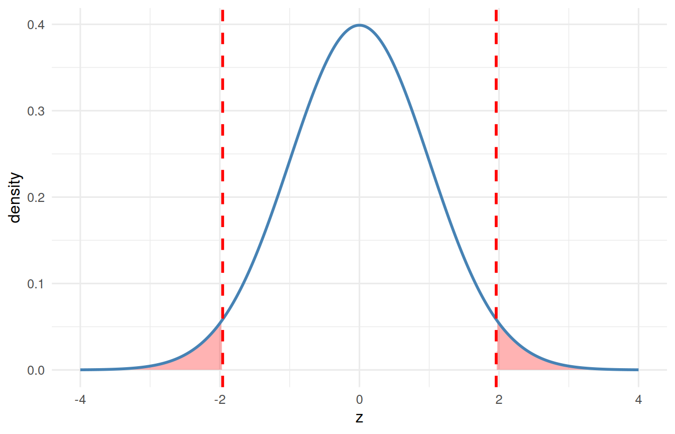
That last line is worth a star: qnorm(0.975) returns 1.96, the number that shows up in every 95% confidence interval and two-tailed test you will ever run. It is not magic - it is just the z-score with 2.5% of the area beyond it in each tail.
# picture the "unusual" tails beyond +/- 1.96tibble(z =seq(-4, 4, length.out =400)) |>mutate(density =dnorm(z)) |>ggplot(aes(x = z, y = density)) +# shade each tail separately, or ggplot joins them across the middlegeom_area(data = \(d) filter(d, abs(z) >=1.96),aes(group = z >0), fill ="red", alpha =0.3) +geom_line(colour ="steelblue", linewidth =1) +geom_vline(xintercept =c(-1.96, 1.96), colour ="red",linetype ="dashed", linewidth =1) +labs(x ="z", y ="density") +theme_book()
Figure 5.3: The standard normal with the tails beyond z = plus or minus 1.96 shaded. Between them those tails hold 5% of the area.
5.6 Percentiles: Where Do You Stand?
Turn a z-score into a percentile with pnorm() and you can say exactly where an observation stands in its distribution:
tibble(height =74, mean =68, sd =4) |># a 74-inch personmutate(z = (height - mean) / sd,percentile =pnorm(z) *100) |>round2()
height
mean
sd
z
percentile
74
68
4
1.5
93.32
A z of 1.5 places this person around the 93rd percentile - taller than about 93% of the population. Percentile ranks, growth charts, and standardized-test scores are all pnorm() in another form.
5.7 Another Ruler: Percent of Maximum Possible (POMP)
The z-score compares a value to its own sample - to the mean and spread of the data you happened to collect. That is exactly right for asking “how unusual is this person?” But it carries a limitation: because z depends on the sample, the same raw score turns into a different z in a different sample, and z-scores from two different measures are not truly on the same footing.
When the goal is to compare measures - say, is work engagement higher than well-being in this study? - a different ruler is more honest: POMP, the Percent Of Maximum Possible. POMP rescales a score to the range the instrument could produce, from its lowest possible value to its highest:
A POMP of 0 is the lowest possible score, 100 the highest, and 50 the exact middle of the scale. Crucially, that meaning does not depend on the sample.
That fixed 0-to-100 range is what makes POMP comparable across measures, and it is also the one thing to remember about it when you come to model a POMP score. A z-score can wander anywhere; a POMP score cannot. It has a floor and a ceiling, real people sit exactly on them, and ordinary regression does not know that. We take that up properly in Outcomes with a Floor and a Ceiling - for now, just notice that the ruler we are recommending is a bounded one. Two measures with completely different response formats - a 1–5 scale and a 1–7 scale - both land on a common 0–100 scale you can read and compare at a glance:
NoteWorking in SPSS, Julia, or Python?
The code tabs below assume this chapter’s data is already loaded. Grab the one-file setup for your language from Getting the Book’s Data, run it once, then load what you need by name - this chapter uses ch05-scores, ch05-pomp. For example, book_data("ch05-scores") in R, Julia, or Python, or !bookdata name = "ch05-scores". in SPSS. Every language reads the same shipped files, so your numbers will match the ones printed here exactly.
pomp <-function(x, lo, hi) 100* (x - lo) / (hi - lo)tibble(measure =c("mood", "vitality"),score =c(4, 5), # answered on a 1-5 scale and a 1-7 scalelo =c(1, 1),hi =c(5, 7)) |>mutate(POMP =pomp(score, lo, hi)) |>round2()
measure
score
lo
hi
POMP
mood
4
1
5
75.00
vitality
5
1
7
66.67
* POMP: 100 * (score - min) / (max - min), using each scale's own
* theoretical minimum and maximum, which travel with the data.
INSERT FILE='data/sim/ch05-pomp.sps'.

COMPUTE POMP = 100 * (score - lo) / (hi - lo).
EXECUTE.
LIST VARIABLES=measure score lo hi POMP.
                 Data List
+--------+--------+--------+--------+-----+
| measure|  score |   lo   |   hi   | POMP|
+--------+--------+--------+--------+-----+
|mood    |4.000000|1.000000|5.000000|75.00|
|vitality|5.000000|1.000000|7.000000|66.67|
+--------+--------+--------+--------+-----+
    measure  score  lo  hi       POMP
0      mood      4   1   5  75.000000
1  vitality      5   1   7  66.666667
On their raw scales, 4 and 5 are hard to compare. In POMP units, the mood score sits at 75% of its possible range and vitality at about 67%, so this person is, if anything, in a slightly better mood than their vitality would suggest. This is the standardization we now use in most of our own papers (PEM): it lets a reader compare outcomes across measures directly, and it has a useful side effect - if a scale’s response format changes partway through a study, the shift in POMP makes the problem hard to miss.
Importantz or POMP: two questions, two rulers
Reach for a z-score to ask how unusual is this value within its distribution? - it locates a person relative to their sample. Reach for POMP to ask how high is this score on what the instrument can measure? - it places a score relative to the possible range, so different measures become comparable. Neither is better; they answer different questions.
ImportantWhy This Chapter Is the Hinge of the Book
Everything inferential rests on one move: standardize, then read the area. When we test a hypothesis, we convert our result to a z-like statistic and ask “how far into the tail is this, if nothing were going on?” When we build a confidence interval, we walk out \(\pm 1.96\) standard errors. The z-distribution is not one more topic - it is the shared machinery of the entire inferential section that follows.
5.8 Challenge
TipDo One Yourself
IQ has mean 100 and sd 15. Using pnorm/qnorm, find (a) the percentile of an IQ of 130, (b) the probability of an IQ above 145, and (c) the IQ that marks the top 1%.
Standardize a variable of your own with scale() and confirm its mean is 0 and sd is 1 (to rounding).
Recreate the shaded-tails plot, but mark \(\pm 1.65\) instead of \(\pm 1.96\). What test decision does 1.65 correspond to (hint: revisit the one-tailed critical value)?
5.9 Where We Go Next
We can now describe where a single value stands. Real science, though, asks how two variables move together. The tool that measures that shared movement - and the true engine under correlation and regression - is covariance.