Everything up to here was training. You have the tools now - distributions, estimation, the linear model, reliability, resampling, Bayes, and the craft of showing data honestly. What no chapter can hand you is judgment: which tool, when, and why - and, just as important, when not to reach for the fancy one. Judgment is learned the way any craft is learned: by watching someone work, seeing the decisions, and hearing why they went one way and not the other. That is what this last part of the book is - an apprenticeship. We stop explaining tools in the abstract and start using them in public, on real projects, with every choice laid bare.
We begin with the friendliest lab I know: The Sports Page, a sister project to this book - a daily newsletter that takes one strange sports number and tells the truth about what it does and does not mean. Sports is a good teacher because the data are rich, the stakes are low, and the future arrives every single day to grade your predictions. If you can be honest about a baseball number, you can be honest about a clinical one.
29.1 Three Things You Can Do With Data
The whole discipline reduces to three verbs, and the first rule is to always know which one you are doing:
Describe what happened. This is easy - the data already know the answer. A batting average, a group mean, an \(R^2\): all description.
Predict what will happen. This is harder, because the future is a real test you can fail. A forecast, a fitted model applied to new cases.
Controlwhy it happens. This is hardest - it requires a mechanism, a cause, not just a curve that fits.
Most sports writing stops at #1 and pretends it is doing #2. Most analytics stops at #2 and pretends it is doing #3. The single most useful habit you can build is to label your own work honestly: this is description, this is prediction, this is a causal claim I have not earned.
ImportantThe past is cheating
Here is the idea that separates a describer from a forecaster: any model flexible enough will fit the past perfectly, and that tells you almost nothing. Fitting the past is easy because you already know how it turned out. The real test is predicting data you have not seen, and then acknowledging it when you were wrong. That is why The Sports Page grades every prediction it makes, on a schedule, in public. Being wrong is not failure; it is the information that improves the next model. If you never publish a prediction that could turn out wrong, you never give yourself a chance to learn.
29.2 A Worked Judgment: The Hot Start Is a Mirage
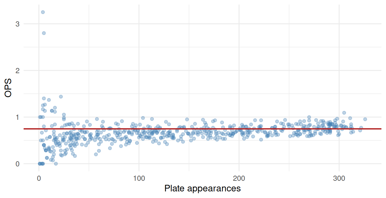
Every April, someone goes 6-for-9 and gets talked about as an MVP. Every April, that call turns out to be premature, and you already have the tools to know why. It is the same lesson as statistical power: small samples are noisy. Watch what happens when we plot every hitter’s performance against how many chances they have had:
NoteWorking in SPSS, Julia, or Python?
This chapter uses data/mlb_hitters_2026.csv directly - no setup needed. See Getting the Book’s Data if you want the setup files for your language.
library(tidyverse) # dplyr, ggplot2, purrr, tibble, readr, stringr, forcatssource("_common.R") # book-wide helpers: round2(), fmt_p(), tidy2()h <-read_csv("data/mlb_hitters_2026.csv", show_col_types =FALSE) # a partial seasonleague_median <- h |>filter(PA >=200) |>summarise(m =median(OPS)) |>pull(m)ggplot(h, aes(PA, OPS)) +geom_point(alpha =0.35, color ="steelblue") +geom_hline(yintercept = league_median, color ="firebrick", linewidth =0.8) +labs(x ="Plate appearances", y ="OPS") +theme_book()
Figure 29.1: OPS vs. plate appearances. Every extreme lives on the left — where the sample is tiny.
* OPS against plate appearances, with a reference line at the league median
* among hitters with 200+ PA.
* GET DATA reads columns POSITIONALLY, so every column in the file has to be
* named - listing only PA and OPS would silently read the first two columns
* (pid and name) under those names instead.
GET DATA /TYPE=TXT /FILE='data/mlb_hitters_2026.csv'
  /DELIMITERS=',' /QUALIFIER='"' /FIRSTCASE=2
  /VARIABLES=pid F16.6 name A24 team A24 PA F16.6 AB F16.6 H F16.6 HR F16.6
             BB F16.6 SO F16.6 AVG F16.6 OBP F16.6 SLG F16.6 OPS F16.6.

* First find the median among the qualified hitters.
TEMPORARY.
SELECT IF (PA >= 200).
FREQUENCIES VARIABLES=OPS /STATISTICS=MEDIAN.

GRAPH /SCATTERPLOT(BIVAR) = PA WITH OPS.
usingCSV, DataFrames, Statistics, Plotsh = CSV.read("data/mlb_hitters_2026.csv", DataFrame) # a partial seasonleague_median =median(h.OPS[h.PA .>=200])scatter(h.PA, h.OPS, alpha =0.35, legend =false, xlabel ="Plate appearances", ylabel ="OPS", title ="The funnel: extremes only survive at small samples")hline!([league_median], color =:firebrick, linewidth =2)
import pandas as pdimport matplotlib.pyplot as plth = pd.read_csv("data/mlb_hitters_2026.csv") # a partial seasonleague_median = h.loc[h.PA >=200, "OPS"].median()plt.scatter(h.PA, h.OPS, alpha=0.35, color="steelblue")plt.axhline(league_median, color="firebrick", linewidth=2)plt.xlabel("Plate appearances"); plt.ylabel("OPS")plt.title("The funnel: extremes only survive at small samples")plt.show()
<matplotlib.collections.PathCollection object at 0x7fd080c3f3b0>
<matplotlib.lines.Line2D object at 0x7fd08059ea20>
Text(0.5, 0, 'Plate appearances')
Text(0, 0.5, 'OPS')
Text(0.5, 1.0, 'The funnel: extremes only survive at small samples')
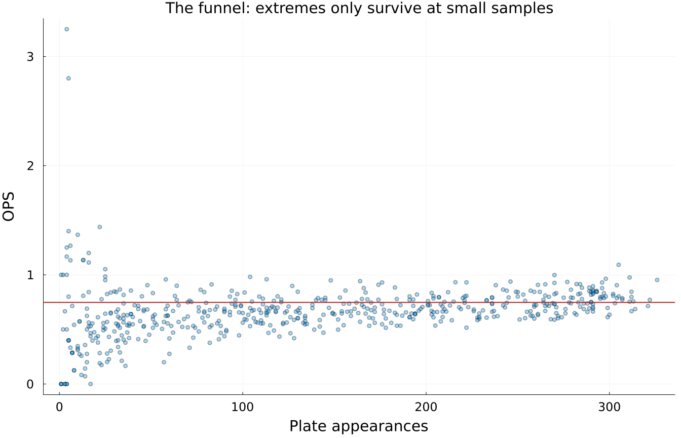
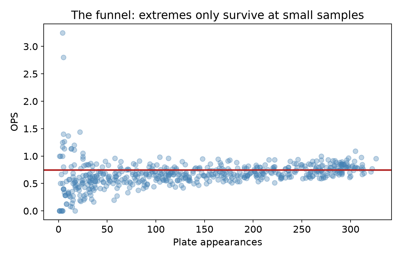
The plot is a funnel. On the right, where hitters have 200+ chances, everyone clusters near the league median (the red line). On the left, where a hitter has batted a handful of times, OPS ranges from near zero to the stratosphere. The numbers make it stark:
h |>summarise(sd_OPS_under_20_PA =sd(OPS[PA <20]), # tiny samples: huge spreadsd_OPS_over_200_PA =sd(OPS[PA >=200]), # big samples: tightbest_OPS =max(OPS),its_plate_appearances = PA[which.max(OPS)] ) |>round2()
sd_OPS_under_20_PA
sd_OPS_over_200_PA
best_OPS
its_plate_appearances
0.59
0.1
3.25
4
GET DATA /TYPE=TXT /FILE='data/mlb_hitters_2026.csv'
  /DELIMITERS=',' /QUALIFIER='"' /FIRSTCASE=2
  /VARIABLES=pid F16.6 name A24 team A24 PA F16.6 AB F16.6 H F16.6 HR F16.6 BB F16.6 SO F16.6 AVG F16.6 OBP F16.6 SLG F16.6 OPS F16.6.
* Spread of OPS at small vs large samples, and the season's best mark.
TEMPORARY.
SELECT IF (PA < 20).
DESCRIPTIVES VARIABLES=OPS /STATISTICS=STDDEV.

TEMPORARY.
SELECT IF (PA >= 200).
DESCRIPTIVES VARIABLES=OPS /STATISTICS=STDDEV.

* The best OPS and the plate appearances behind it.
SORT CASES BY OPS (D).
LIST VARIABLES=OPS PA /CASES=1.
      Descriptive Statistics
+--------------------+--+-------+
|                    | N|Std Dev|
+--------------------+--+-------+
|OPS                 |64|    .59|
|Valid N (listwise)  |64|       |
|Missing N (listwise)| 0|       |
+--------------------+--+-------+

      Descriptive Statistics
+--------------------+---+-------+
|                    | N |Std Dev|
+--------------------+---+-------+
|OPS                 |182|    .10|
|Valid N (listwise)  |182|       |
|Missing N (listwise)|  0|       |
+--------------------+---+-------+

     Data List
+--------+--------+
|   OPS  |   PA   |
+--------+--------+
|3.250000|4.000000|
+--------+--------+
usingCSV, DataFrames, Statistics, Plotsh = CSV.read("data/mlb_hitters_2026.csv", DataFrame)usingStatisticsstd(h.OPS[h.PA .<20]) # tiny samples: huge spreadstd(h.OPS[h.PA .>=200]) # big samples: tightbest =argmax(h.OPS)h.OPS[best], h.PA[best] # the best mark, and how few chances made it
0.5896091385485137
0.1019636849192731
(3.25, 4)
import pandas as pdimport matplotlib.pyplot as plth = pd.read_csv("data/mlb_hitters_2026.csv")h.loc[h.PA <20, "OPS"].std() # tiny samples: huge spreadh.loc[h.PA >=200, "OPS"].std() # big samples: tightbest = h.OPS.idxmax()h.loc[best, ["OPS", "PA"]] # the best mark, and how few chances made it
np.float64(0.5896091385485139)
np.float64(0.1019636849192731)
OPS    3.25
PA     4.00
Name: 0, dtype: float64
The best OPS in the league belongs to someone with a single-digit number of at-bats. That is not a hitter who has cracked the code; that is mostly sampling noise in a very small sample. The honest read: a hot start is description of a tiny sample, and mistaking it for prediction is one of the most common errors in sports, and in science more broadly. The player will “regress to the mean” not because of some mysterious force, but because the extreme value was mostly luck, and luck does not carry over to the rest of the season.
This is the entire apprenticeship in one figure. The math was easy (a standard deviation). The judgment, recognizing that the April headline is describing noise while treating it as signal, is the hard part, and the valuable one.
Describe: strikeouts per nine innings rose from about 5.4 to about 8.5 since 1985. (True, easy, and only a description.)
Predict: will it keep rising? You could fit a line and extrapolate, but now you owe the reader a graded forecast, and a cautious one, because trends bend. Extrapolation is where flexible models most often go wrong.
Control:why did it rise? Harder velocity, analytics rewarding the home-run-or-strikeout trade-off, bigger bullpens. Those are causal claims, and a line through the past cannot establish any of them; it can only describe the pattern they leave behind.
Same data, three very different epistemic commitments. Keeping them straight is not pedantry; it is the difference between careful analysis and guessing.
29.4 What Comes Next
With the philosophy in hand, we turn to the real thing: published research, walked through end to end, with every decision on the table. You will watch measures get built and defended, watch a total score throw away information it should have kept, and watch missing data quietly change an answer. These are not toy examples; they are real studies, real datasets, and real judgment calls, some of which we would make differently today. That honesty is the point. Welcome to the apprenticeship; let’s go to work.