The journey to master statistics starts with a simple concept - uncertainty. We all know what it feels like to be uncertain. Some think of it as a gut feeling. Many books begin with the mundane details such as data types or programming language basics; we offer those details here. We also offer structure to better understand what statistics do for us. Statistics is a tool designed by humans to serve humans. If you are a human and vote either with your wallet and/or at the ballot box, you might find this book helpful. Voting is a decision that ought to be guided by your uncertainty. Putting numbers to your uncertainty is the aim of statistics. We will guide you through the learning process.
Should I read this book?
We have no clue if you should read the book; only you can answer that question. Tick whatever is true for you - the more you tick, the more enthusiastic we get.
0 / 7Nothing ticked yet. No pressure - go on, tick the true ones.
Tick even one and you might find this book useful. We hope you read on.
Not a graduate student? That is fine. Read the book anyway. Arm yourself with knowledge of how uncertainty gets communicated. You - the reader - can make more informed decisions when you quantify your uncertainty. We wrote this book with graduate students in mind since most had a previous undergraduate course in statistics that, no doubt, was taught a very standard way. That way does not bode well for long-term retention. Most students forget the details and only a small minority retain the essentials. We assume only a passing familiarity. Most people have the background we assume in this book.
Statistics is a tool to do one thing: quantify uncertainty. Approach the topic with that frame of reference and you will master statistics. How quickly? Depends upon your willingness to devote time to read and apply what you learn. We offer you a path towards understanding, quantifying and mastering your uncertainty. Good luck and welcome to the show.
What We Expect from You
As implied in our self-check above, you need to read English, be motivated and have some resources to both read this book and run the code we provide. You must be willing to read and apply what you learn.
What To Expect
Six things. Each one is a heading you can open if you want the detail, and skip if you would rather get on with it.
Structure - a framework to understand and master statistics
Everything in this book hangs off one idea: **quantifying uncertainty**. The parts are ordered so that each one earns the next.
We start with a single variable and ask where it sits and how much it spreads - that spread *is* the uncertainty. Then two variables, and how they move together, which turns out to be the engine underneath correlation, regression, and ANOVA alike. Then we stop to ask whether the measurements deserve our trust at all, because a model built on a broken ruler predicts nothing. Only then do we build models, and finally we look at what to do when the tidy assumptions fail.
The point of the order is that you should never meet a technique before you have met the reason it exists. When a formula turns up, you will already know what question it answers.
Brevity - short, concise descriptions of key concepts
We would rather you read a short chapter three times than abandon a long one once. Chapters are deliberately compact, and the code chunks are short enough to read top to bottom without scrolling.
Where a topic genuinely needs a book of its own - measurement, causal inference, missing data - we say so, give you the working version, and point you at the definitive treatment in the references.
Examples - real-world examples to illustrate the concepts
Wherever we can, the data is real and so are the decisions. A good deal of it comes from our own published work and from the graduate courses this book grew out of: college GPAs, a ten-item scale with a reverse-worded item that has to be caught, depression symptom profiles, Ben Wright's original Knox Cube Test responses.
Real data misbehaves. That is the point of using it. Simulated examples appear when we need to *know* the right answer in advance so you can watch a method find it - or fail to.
Code - statistical software code to demonstrate the concepts
Every procedure in this book is shown in **R, SPSS, Julia, and Python**, in tabs you can click between. The R tab is live: it runs as the book is built, so the numbers you see are the numbers that code produced.
Working in one of the other three? See [Getting the Book's Data](setup.qmd) for a one-file setup so your numbers match ours exactly. And where a language genuinely cannot do something, its tab says so plainly and names the tool that can, rather than inventing syntax that would not run.
Challenges - exercises to test your understanding
Most chapters end with a **Do One Yourself** box. These are not busywork. They usually ask you to rebuild a number the chapter just handed you - compute a standard error by hand and confirm it against the software, or break an assumption on purpose and watch what happens.
Nothing in this book should stay a black box. The challenges are where you find out whether it has.
References - where to go deeper
Citations point to the sources we actually rely on, not a decorative reading list. Some are classics you should meet at least once - Meehl on why the null hypothesis was always a straw man, Cohen on multiple regression, Wright on measurement. Others are our own work, cited where the book leans on it, so you can check our reasoning.
How To Read This Book
Pace yourself. Expect familiarity after your first read, some facility after your second read, and moderate mastery after your third read. So, expect to read the book 3 times. Why? We know that repetition is key to mastery. Lather, rinse, repeat. If it is good enough for your hair, it surely is good enough for your brain.
Mastery of Statistics
My (PEM) graduate advisor Lee Sechrest often likened learning to a helix. Every student enters the helix at the same level (bottom) when they begin learning any topic and spiral upward. Some students spiral faster than others; some students start higher than others. The goal is to spiral upward - a motion towards mastery. Will you master statistics in one semester or one resource? No. Mastery is aspiration. Keep pushing.
The Helix Model of Learning
NoteWorking in SPSS, Julia, or Python?
The code tabs below assume this chapter’s data is already loaded. Grab the one-file setup for your language from Getting the Book’s Data, run it once, then load what you need by name - this chapter uses intro-people. For example, book_data("intro-people") in R, Julia, or Python, or !bookdata name = "intro-people". in SPSS. Every language reads the same shipped files, so your numbers will match the ones printed here exactly.
# Load the necessary librarieslibrary(tidyverse) # dplyr, ggplot2, purrr, tibble, readr, stringr, forcatslibrary(plotly) # interactive 3Dsource("_common.R") # book-wide helpers: round2(), fmt_p(), tidy2()# Create data for the helix: every learner enters at the bottom and spirals# upward toward mastery.theta <-seq(0, 6* pi, length.out =500)helix_df <-tibble(x =cos(theta),y =sin(theta),z = theta,lvl =rep(c("1. Basic Arithmetic", "2. Simple Calculations","3. Conceptual Understanding", "4. Principled Application","5. Mastery"), each =100),mperc =seq(0, 100, length.out =500))# Precompute a plain-text hover label per point. (Referencing non-existent# plotly fields with format codes like %{lvl:.0%} makes the 3D plot fail to# draw; a ready-made text label with hoverinfo = "text" is the robust idiom.)helix_df$label <-paste0(helix_df$lvl, "<br>Mastery: ", round(helix_df$mperc), "%")# Create the 3D helix. It sits on a light figure card (see brand.scss), so the# default light background + dark text read cleanly on either book theme.plot_ly(helix_df,x =~x, y =~y, z =~z,type ="scatter3d",mode ="lines",color =~lvl,line =list(width =6),text =~label,hoverinfo ="text") %>%layout(legend =list(title =list(text ="Level of Mastery")),scene =list(xaxis =list(title ="", showgrid =FALSE, zeroline =FALSE, showline =FALSE, showticklabels =FALSE),yaxis =list(title ="", showgrid =FALSE, zeroline =FALSE, showline =FALSE, showticklabels =FALSE),zaxis =list(title ="", showgrid =FALSE, zeroline =FALSE, showline =FALSE, showticklabels =FALSE) ) )
Figure 1: The Helix Model of Learning
* Valid SPSS, shown rather than run: PSPP has not implemented the 3-D
* scatterplot. SPSS also has no interactive 3D line plot - the spiral shape
* is visible in a static 3-D scatter, but it cannot be rotated or hovered
* the way the R version can.
INPUT PROGRAM.
LOOP #i = 0 TO 499.
  COMPUTE theta = #i * (6 * 3.14159265 / 499).
  COMPUTE x = COS(theta).
  COMPUTE y = SIN(theta).
  COMPUTE z = theta.
  END CASE.
END LOOP.
END FILE.
END INPUT PROGRAM.
EXECUTE.

GRAPH /SCATTERPLOT(XYZ) = x WITH y WITH z.
# Shown rather than run: PlotlyJS produces an interactive widget, which the# book's Julia engine (which captures static images) cannot embed. Run it# yourself and you get the same rotatable helix the R tab shows.usingPlotlyJStheta =range(0, 6pi, length =500)plot(scatter3d(x =cos.(theta), y =sin.(theta), z = theta, mode ="lines", line =attr(width =6)),Layout(title ="The Helix Model of Learning"))
# Shown rather than run: plotly produces an interactive widget, which the# book's Python engine (which captures static images) cannot embed. Run it# yourself and you get the same rotatable helix the R tab shows.import numpy as npimport plotly.graph_objects as gotheta = np.linspace(0, 6* np.pi, 500)fig = go.Figure(go.Scatter3d(x=np.cos(theta), y=np.sin(theta), z=theta, mode="lines", line=dict(width=6)))fig.update_layout(title="The Helix Model of Learning")fig.show()
A 30,000 ft View of Statistics
The structure begins here. We offer you a 30,000 ft view of statistics and guide you through an example, highlight some key concepts, define them, and then demonstrate their usefulness in the entire endeavor. Our framework allows you to revisit these key terms and concepts as you progress through the book.
Uncertainty
To begin, the structural core of statistics is uncertainty. We know not what we don’t know but we can quantify it with (false) precision. Quantifying uncertainty is the singular aim of all statistical methods. Methods include estimation, summary, prediction, and testing. Ultimately, people who use statistics either serve or serve as scientists. Our primary aim is to ensure that our scientists can use these tools effectively to quantify their own uncertainty. We share with you (the world) the same materials.
The Scientific Method (for reals)
We learn early on in school a serious falsehood. Science is not a lock-step path of hypothesis generation, stringent testing, and careful reporting. Far from it. There are scientists and scoundrels among us. Most of us try to do the best we can with what we have available. Some fabricate data. Some fabricate studies. Most of us do our best to conduct research consistent with our scientific mission - to describe, predict, and control the world around us. That sounds so sinister but those are the aims of science. Instead of the lock-step scientific method, we often come up with questions that are routinely rejected (\(p > 0.05\)) by data we scarcely know much about regarding the reliability or, gasp, the validity of our measures. After reading this book, you will learn the background to why those statements are so easy to defend in most scientific areas.
The real scientific method as practiced involves hundreds of hours reading relevant literature, searching for testable assumptions (aka “holes in the literature”), designing studies, cleaning/analyzing data, and interpreting the results. All of these steps often take place with limited resources. We must make the most of what we have available. Social scientists often study unobservable constructs (e.g., intelligence, personality, etc.) and must rely on observable indicators (e.g., test scores, self-report measures, etc.) to make inferences. The inferential process is fraught with uncertainty.
We must quantify that uncertainty to make the best decisions possible. We must also be honest about the limitations of our data, our methods, our inferences, and our conclusions. We must be honest about the limits of our knowledge and our understanding.
That house of cards leads to many researchers hunting for new, potential findings worthy of further inquiry. Failed tests lead to fishing expeditions to find something worthy of publication. Why? We must publish to keep our jobs. So, we find stuff to publish. Failed initial tests? Don’t despair! You will find something to report in every dataset. Sir Ronald Fisher, interpreted the results of significant hypothesis tests worthy of further study - nothing more. He too opined that such tests were mere reason for optimism and not the ultimate arbiter of scientific relevance. Thus, all findings are findings worthy of further study. Sometimes, that further study stops with greater care and attention to the data; other times, we must conduct further empirical investigations to rule out alternative explanations. Here and further along in your journey, you will come back to this first paragraph and (hopefully) reflect on your own uncertainty.
EXAMPLE 1: Ice Cream Preference
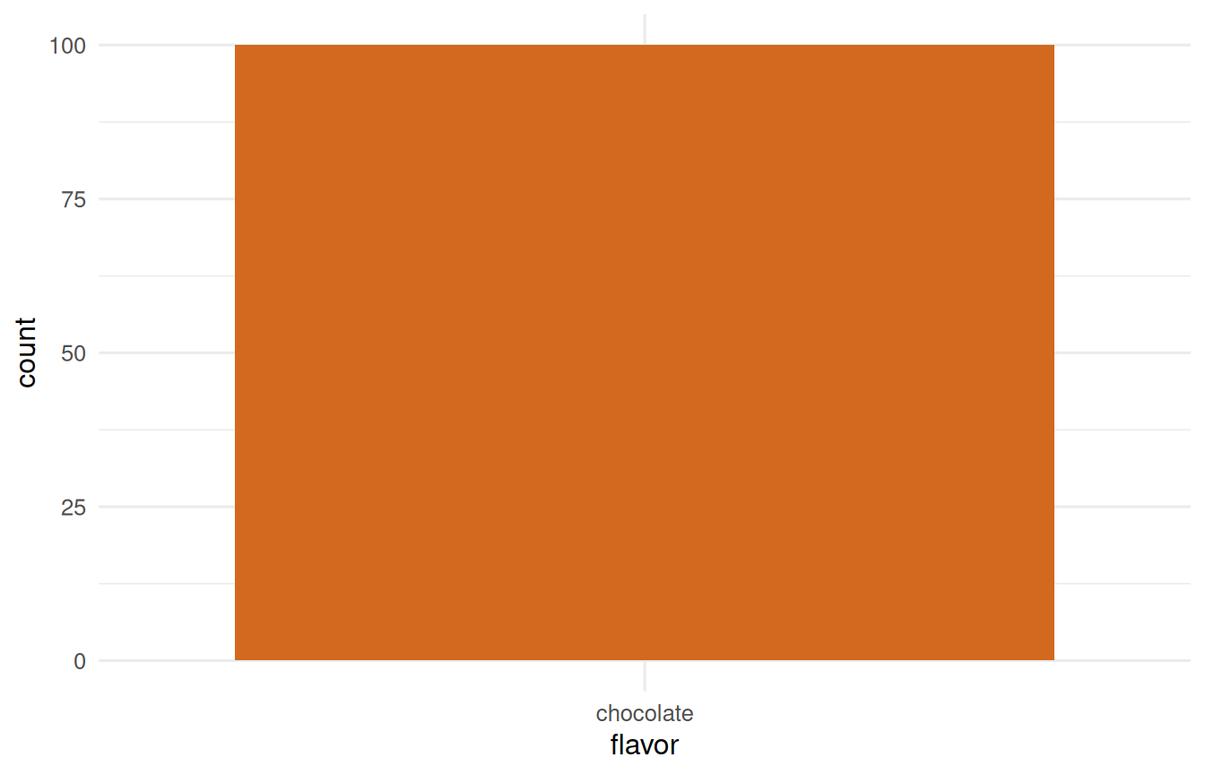
Imagine a boring world where everyone liked chocolate ice cream. We would have no need for statistics or science for prediction; we have both perfect prediction and certainty. If just one person liked vanilla instead of chocolate, we would have uncertainty - not much uncertainty because it would still be prudent to guess that everyone liked chocolate ice cream. One error that occurs 1/N times can be quite trivial with a large sample. This seemingly trivial example brings all of the statistics you need to undestand in English. Now, we need to take these ideas from English and convert them into statistical language. Don’t worry, the language will become second nature and your understanding will deepen with each passing use. We introduced many concepts in this first example including:
Variables and Constants
A variable is a characteristic that can take on different values. Here the variable is the ice cream flavor a person would order, and it can take the values chocolate, vanilla, strawberry, mint chip, or rocky road. A constant is a value that does not change.
So when we say variable, we mean a characteristic we want to understand better - or one we want to use to predict something else we care about. When we say constant, we mean a value that stays put. Variables vary; constants do not. That distinction sounds almost too simple to state, and it is the hinge everything else swings on.
Yes, we yelled it. If you learn nothing else from this resource, please master VARIANCE. As we alluded to above, the characteristics that we measure differ between people (e.g., height) and within a person (e.g., weight). To our example, we can imagine ice cream preference differing between people (i.e., some people prefer vanilla to chocolate) and within each (i.e., our tastes change as we age). The differences between or changes within are variance. You will learn that there are formal definitions, graphical depictions, and qualifiers to variance. For now, remember that variance is a measure of how much difference exists in your variables. More differences are preferable to fewer differences. Why? Differences are what we study. We study differences to understand the world around us, to predict the future, and to gain some control over the world. Variance is the measure of differences and, as a result, variance is the measure of uncertainty. We shall return to this concept often.
The Rest of the Vocabulary, in One Pass
Variance is the one we yell about. The remaining words from this example are worth meeting properly too, and they are easier to learn as a chain than as a pile, because each one leads to the next.
We predict. That is what science does: given what we know, what is our best guess about what we have not seen? In the ice cream world, our prediction is “chocolate,” because almost everyone orders it.
Predictions miss, and the gap is error: \(e = \text{observed} - \text{predicted}\). The person who ordered vanilla is our error. Do not read “error” as “mistake” - nobody blundered. It is simply the part of the world our prediction failed to capture, and shrinking it, or at least understanding it, is most of what statistics actually does.
Because we cannot eliminate error, we put a number on how often we expect it. That number is a probability, scaled from 0 (never happens) to 1 (certain). Probability is the common currency of uncertainty; every p-value and every confidence interval later in this book is a probability wearing a costume.
Where do those numbers come from? Usually from counting. A frequency is how often something happens - a raw tally, the most honest number in statistics, because you can point at the people you counted. Ninety-five chocolate, one vanilla, and so on.
Pile those counts across every value a variable can take and you have a distribution: the pattern the frequencies make, the shape of how often each value shows up. Almost everything from here on is a claim about a distribution - where its center is, how wide it spreads, and how surprising some particular value is within it.
We never get to see the whole distribution, though, because we cannot ask everyone. We see a sample, the subset we actually observed. Every voter, every patient, every ice cream eater - the population is out of reach, and the sample is our narrow window onto it. The whole enterprise of inference is guessing about what is out there through that window.
How narrow the window is has a name: sample size, written \(N\). Bigger samples buy precision, which is why \(N\) shows up in nearly every formula in this book. More is not always better, but it is almost always more certain.
That is the vocabulary. Here it is in one place, for when you want to check a word without rereading the paragraph:
Term
What it means
Variable
A characteristic that takes different values
Constant
A value that does not change
Variance
How much difference there is - the measure of uncertainty
# Start with a small, manageable sample sizeN <-100# create a vector of ice cream flavorsflavors <-c("chocolate", "vanilla", "strawberry", "mint chip", "rocky road")# a data frame of ice cream preferences - everyone picks chocolateic_prefs <-tibble(id =1:N, flavor =factor(rep("chocolate", N), levels = flavors))ggplot(ic_prefs, aes(x = flavor)) +geom_bar(fill ="chocolate") +theme_book()
Figure 1.2: A world where everyone orders chocolate: perfect prediction, and no need for statistics.
# 1000 people who pick chocolate almost every timetibble(flavor =sample(flavors, 1000, replace =TRUE,prob =c(0.95, 0.02, 0.01, 0.01, 0.01))) |>count(flavor)
flavor
n
chocolate
951
mint chip
8
rocky road
11
strawberry
12
vanilla
18
# 1000 people with far more varied tastestibble(flavor =sample(flavors, 1000, replace =TRUE,prob =c(0.5, 0.1, 0.1, 0.1, 0.2))) |>count(flavor)
flavor
n
chocolate
510
mint chip
93
rocky road
209
strawberry
89
vanilla
99
* Everyone picks chocolate, then two samples with different tastes.
* SPSS draws a category by comparing a uniform draw to cumulative
* probabilities - there is no direct equivalent of R's sample(prob = ...).
INPUT PROGRAM.
LOOP #i = 1 TO 1000.
  COMPUTE u = RV.UNIFORM(0, 1).
  DO IF u < .95.
    COMPUTE flavor = 1.
  ELSE IF u < .97.
    COMPUTE flavor = 2.
  ELSE IF u < .98.
    COMPUTE flavor = 3.
  ELSE IF u < .99.
    COMPUTE flavor = 4.
  ELSE.
    COMPUTE flavor = 5.
  END IF.
  END CASE.
END LOOP.
END FILE.
END INPUT PROGRAM.
VALUE LABELS flavor 1 'chocolate' 2 'vanilla' 3 'strawberry'
                    4 'mint chip' 5 'rocky road'.
EXECUTE.

FREQUENCIES VARIABLES=flavor.
usingStatsBase, DataFramesflavors = ["chocolate", "vanilla", "strawberry", "mint chip", "rocky road"]# 1000 people who pick chocolate almost every timepicks =sample(flavors, Weights([0.95, 0.02, 0.01, 0.01, 0.01]), 1000)countmap(picks)# 1000 people with far more varied tastespicks =sample(flavors, Weights([0.5, 0.1, 0.1, 0.1, 0.2]), 1000)countmap(picks)
import numpy as np, pandas as pdrng = np.random.default_rng()flavors = ["chocolate", "vanilla", "strawberry", "mint chip", "rocky road"]# 1000 people who pick chocolate almost every timepicks = rng.choice(flavors, 1000, p=[0.95, 0.02, 0.01, 0.01, 0.01])pd.Series(picks).value_counts()# 1000 people with far more varied tastespicks = rng.choice(flavors, 1000, p=[0.5, 0.1, 0.1, 0.1, 0.2])pd.Series(picks).value_counts()
Who might be such a person to go against the social norms?
Sir Ronald Fisher, one of the early contributors to frequentist statistics, once said, “To consult the statistician after an experiment is finished is often merely to ask him to conduct a post mortem examination. He can perhaps say what the experiment died of.” Such a post mortem were apropos.
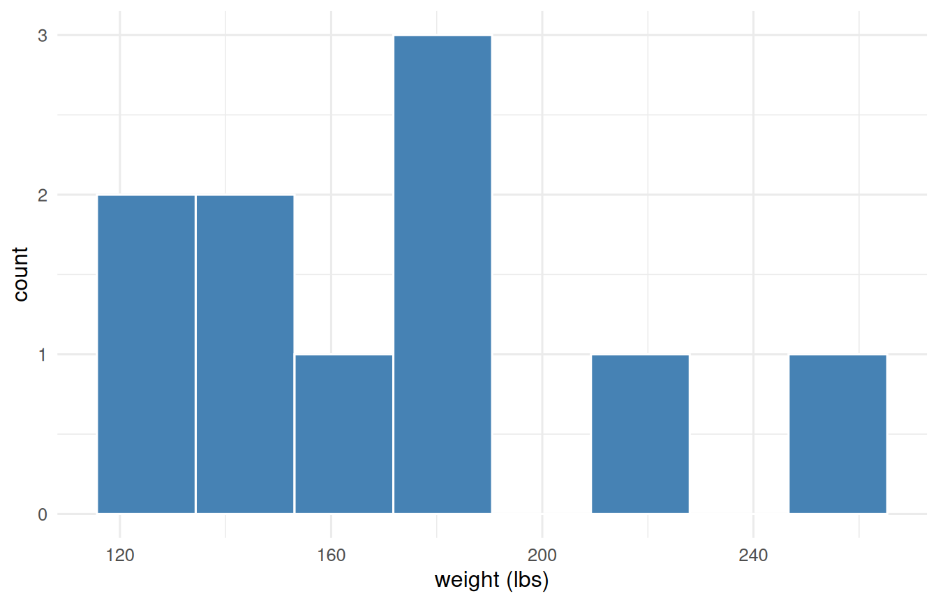
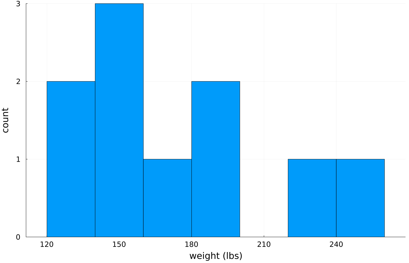
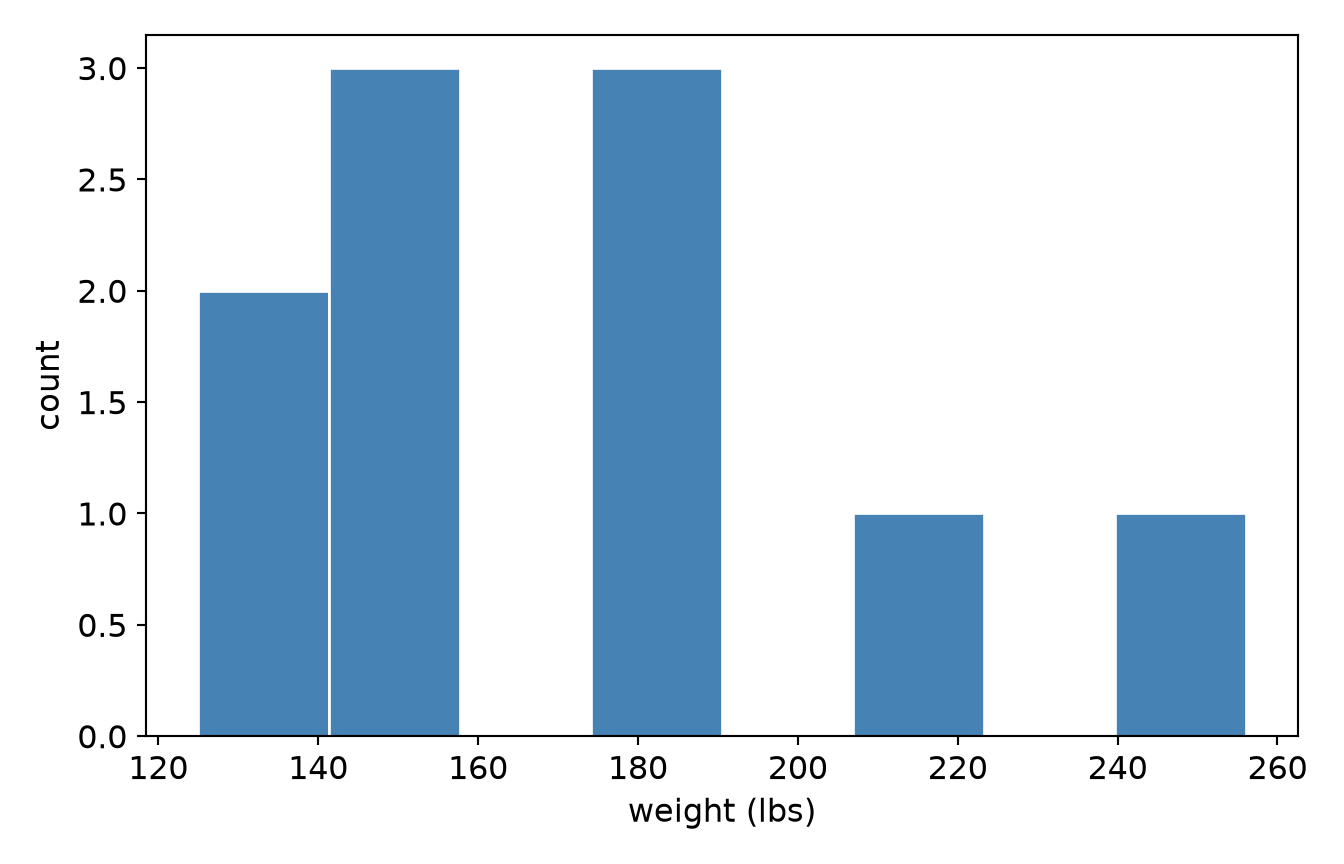
Each require some must start with the first general principle - uncertainty or rather quantifying uncertainty. To fully grasp the concept of uncertainty, we offer you a simple exercise. Suppose you were to guess the weight of any adult family member. Your best guess would likely be off. Empirical evidence, however, suggests that the best guess is the arithmetic mean. Why?
people |>summarise(mean =mean(weight),median =median(weight),sd =sd(weight) ) |>round2()
mean
median
sd
172.3
165
41.74
Figure 1.3: The ten weights whose mean we are asking you to guess.
* The mean, median and SD of the ten weights, plus their histogram.
INSERT FILE='data/sim/intro-people.sps'.

DESCRIPTIVES VARIABLES=weight /STATISTICS=MEAN STDDEV.
FREQUENCIES VARIABLES=weight /STATISTICS=MEDIAN /HISTOGRAM.